|
by Brendan Reed on April 24, 2018
Instead of scrolling through rows of data to glean insights, one well-crafted visual can make it easier to understand what’s going on, and help you make decisions more quickly. Charts can highlight outliers, trends, and other details you need to see to make the best choice for your business.
Our most recent additions to Smartsheet dashboards will help you supercharge your data visualization and give you more flexibility in your data sources, so you can get the information you need to make better-informed decisions more quickly. With our charts enhancements, you now have ten new chart variations at your fingertips for more ways to visualize your data in a dashboard. You also have the ability to create charts from reports. Add multiple data sources to one report, then create a chart from that report to bring multiple sources into one visual for a more complete picture. Not only that, but we’ve given you more flexibility on your sheet data structures for charts. Now you can select the specific columns you want to include in a chart, without needing to rearrange your sheet data to include what you want into your chart. Here’s how each of these enhancements work for you and your team to better visualize data: 1. Build More Chart Types for Better Data Visualization
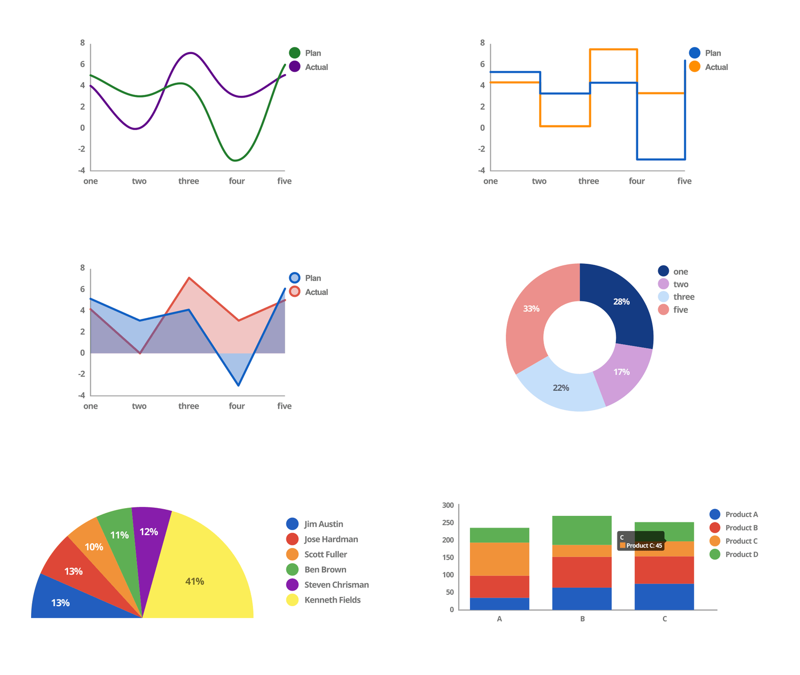
We’re proud to present ten new chart variations — for a total of fourteen chart types — designed for those of you who depend on data to tell stories. These new customizable visual options help your teams present data in many formats:
2. Create Charts Using Data From Reports
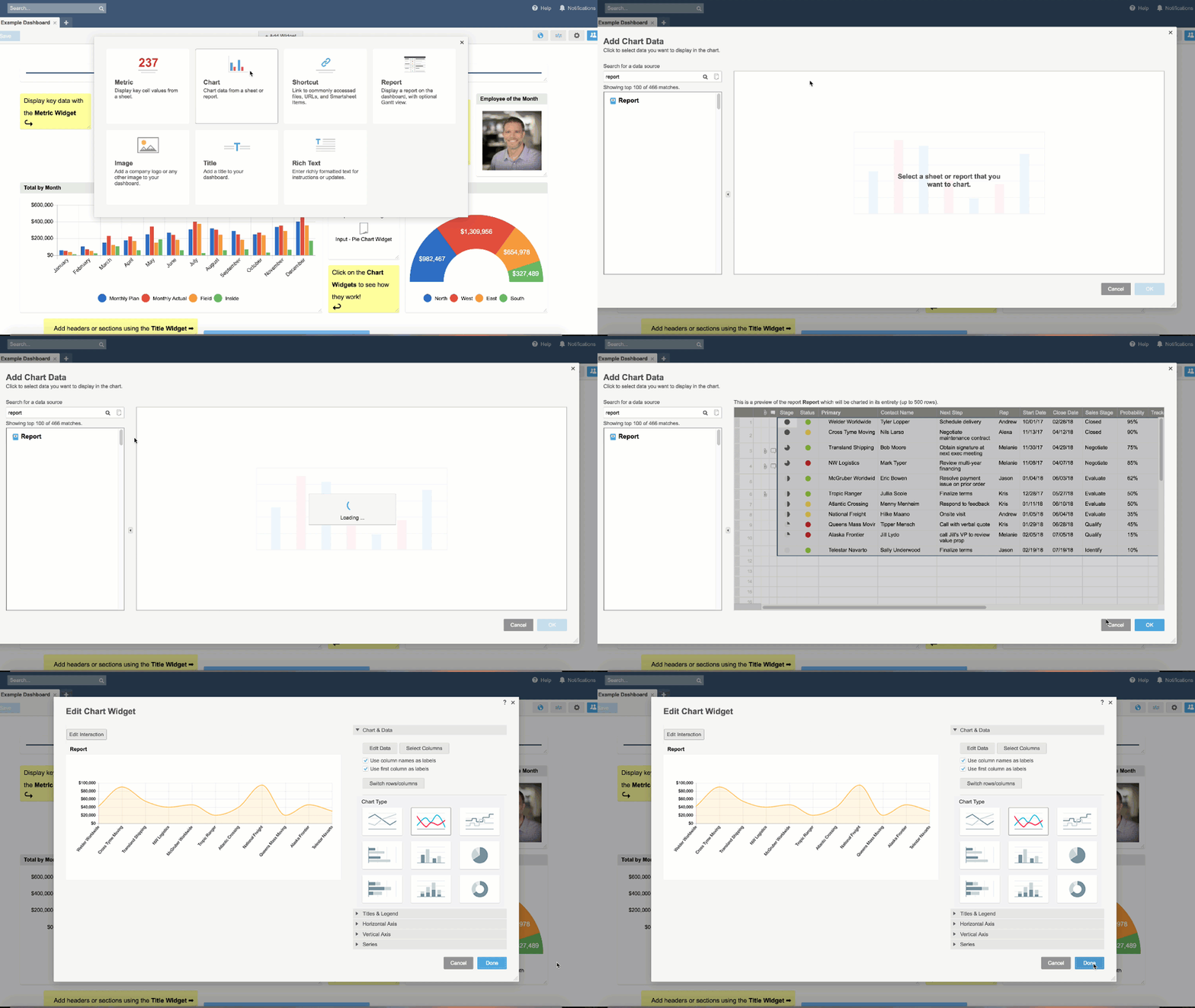
While these new chart types give you more options when presenting data, we took further steps to make dashboards more robust. You can now create charts by pulling data from reports — selecting from a full report or specific columns in a report.
Using reports is an effective way to combine multiple sheets into a single source of truth that admins can share with teammates and stakeholders, then surface key data points to executives in dashboards. Now teams can be more flexible with how they build charts and dashboards, and include reports they reference on a regular basis in a roll-up view.
3. Easily Select Nonadjacent Data From Columns
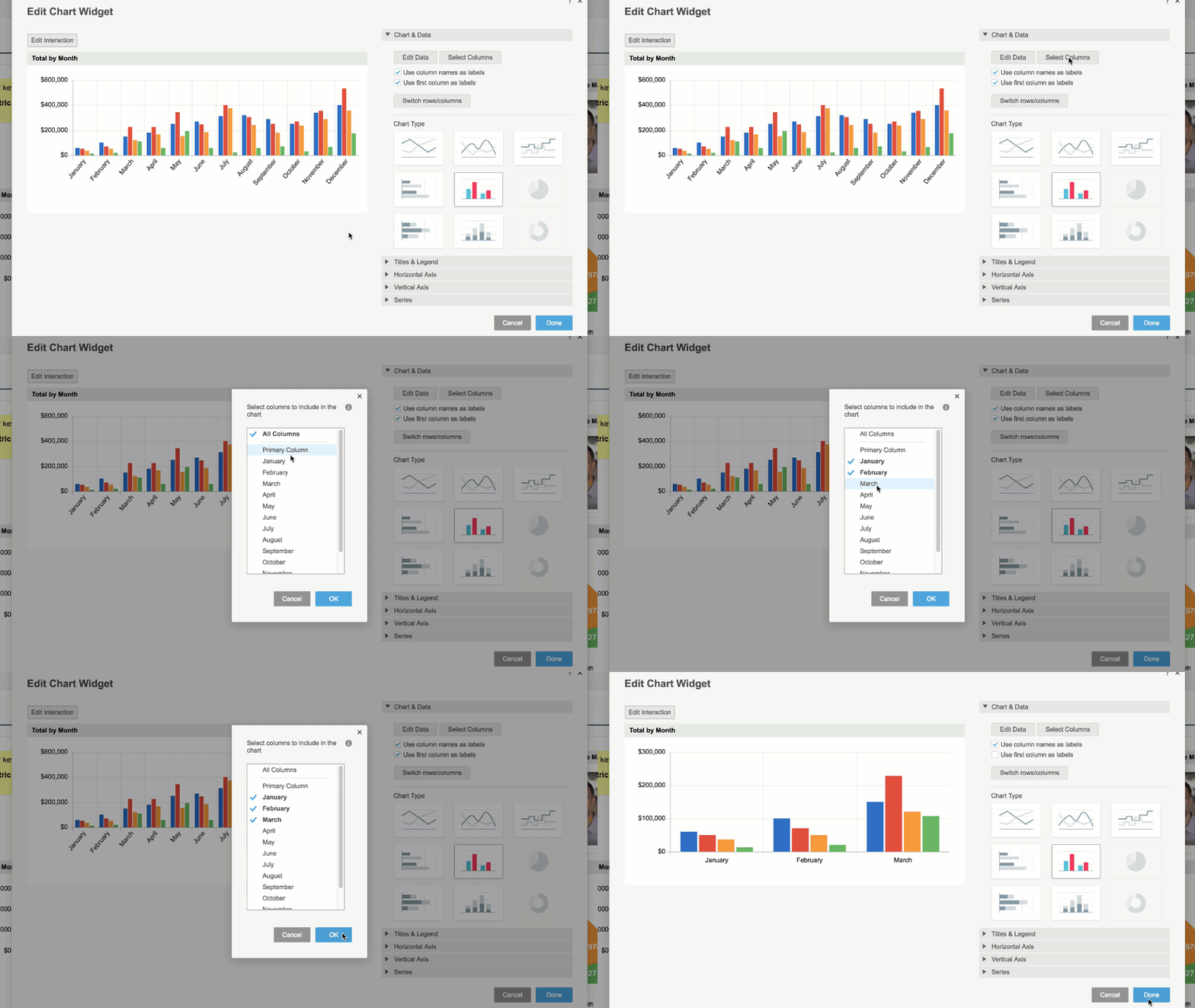
You can now choose data from separate columns when building out your charts. Once your team agrees on the right data points, you can pull them from nonadjacent cells, columns, or rows, then centralize those pertinent learnings in a Smartsheet dashboard.
With the flexibility to build multiple charts from a single sheet or report, you don’t have to spend as much time toggling between sheets. You’ll also be able to provide access to specific data for individuals and leaders in a visual way, without needing to replicate data sources.
As you can see from the graphics above, more chart visualizations and data sources mean teams gain more flexibility in how they display and report on their data. And the results can be surprising. “Charts enable us to present our project’s KPIs in an easy-to-understand manner — and it didn’t even take long to develop them,” says Jamal Khalid, Project Manager of Applications, External Digital Services & Emerging Technologies at Toronto Public Libraries. “We used charts to showcase our project efficiencies for our directors to help them see the bigger picture and better understand where our project stands. The results have been impressive.” Charts and other dashboard features are available to Smartsheet customers on Business or eligible Enterprise plans. If you’re on a Team or Individual plan and interested in checking out dashboards with charts, contact our team today. Already have an eligible plan and looking for ideas and inspiration for your dashboard? Check out the Smartsheet Dashboard Gallery for example dashboards and use cases, or watch our video, Getting Started with Dashboards, that’ll help you get launched. Source: Smartsheet Blog |
|
Care line: +603-9212 0157
|
Leave us your inquiry |
|
This company is registered with the Ministry of Finance, Malaysia.
Equip your organisation with digital solutions & training that inspire innovation and joy at work. Copyright © 2024 57Network Consultancy Sdn. Bhd. Company Registration number : 202001020346 (1376666-K) All rights reserved. |


